Why I have finally taken off the Apple Watch for the last time.
 |
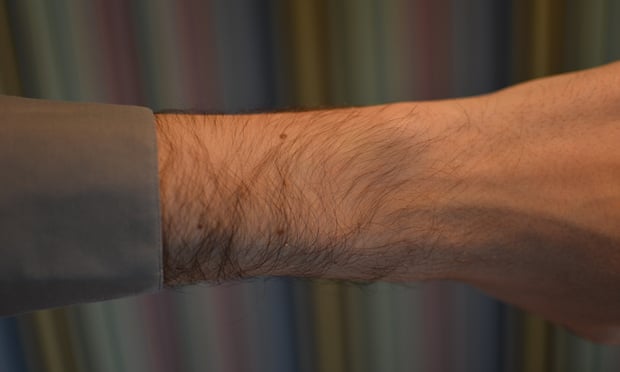
| Gone for good: my wrist without an Apple Watch. Photograph: Samuel Gibbs for the Guardian |
I’d been wearing the £479 38mm Apple Watch with a sapphire screen, stainless steel shell and white sport band – something I genuinely appreciated as an article of jewellery – since we bought it at the launch in April last year.
I’d taken it off before of course, not only every night to charge, but when my colleague Samuel Gibbs reviewed it and then reviewed its updated operating system. But this time, while another colleague used it, I realised there was no point in wearing it.
 |
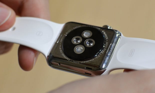
| Taking off the Apple Watch. Photograph: Samuel Gibbs for the Guardian |
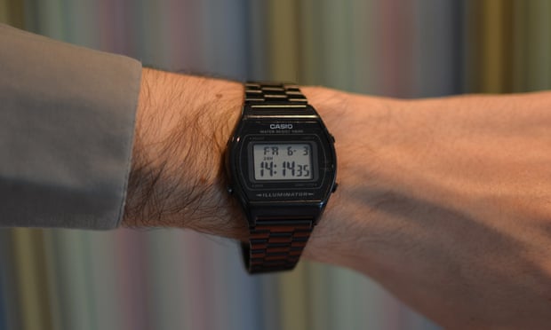
I’m no style guru (I’m now wearing a bashed-up Casio B640W), but I liked the look of the thing. It’s nicer in the flesh than in pictures, and there’s a certain dorky charm to having a computer on your wrist. But that’s faint praise for something that costs almost half a grand.
Before the Apple Watch came out, the key fear on the part of would-be early adopters was over the battery life. We pored over statements like Tim Cook’s: “We think you’re going to end up charging it daily. Overnight, that’s what we think.” How could anyone use a watch that needed charging every night?!
It turns out it’s really easy. You just take it off every night, and charge it. You don’t use your watch at night, because you’re asleep.
We all adjusted to this shifted expectation when smartphones were introduced, and while many would wish for a phone with a bit more battery life, few would trade their current device for a Nokia 3310, even through that got weeks out of a battery. And heck, unlike my iPhone, the Watch never once ran out of battery in a single day.
But that’s not necessarily a good thing. The reason why the Watch’s battery lasted so long is largely because I never really used it.
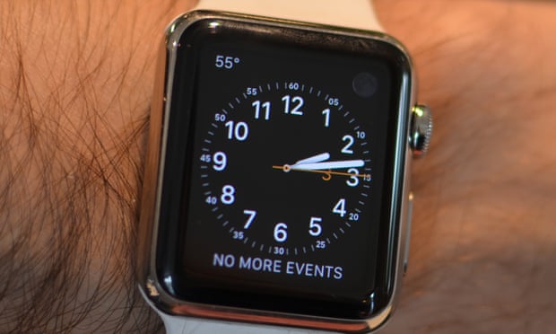
I wore the watch for nine months. In the week since I stopped wearing it, I have missed precisely one thing: the Dark Sky “complication” in the top left-hand corner of the watch face.
 |
| The (very) dear departed Apple Watch, with the much-loved Dark Sky complication in the top left. Photograph: Samuel Gibbs for the Guardian |
Dark Sky, a weather app, was one of the first apps I installed on the Apple Watch. But it, like every other watch app, was hampered by the fact that it takes an insanely long time to open: correctly hitting the right icon is a fiddly business requiring your full concentration, and it’s not really any better than just taking out your phone.
But when Watch OS 2 launched, in October, Apple gave third parties the ability to add “complications” – small data feeds – to the face of the main watch. That meant Dark Sky could now put the temperature on the watch face, visible at a glance, and replace it with a small umbrella icon if rain was predicted within the next 15 minutes.
It’s a small thing, but it was something I habitually checked every morning, as I was getting dressed, to help me decide what to wear (see above re: Not a Style Guru).
Tellingly, after a week of wearing an old-school digital watch, it is the only thing I find myself trying to do. Every single other use case – checking notifications, setting timers, or recording physical activity – has seamlessly, painlessly, slipped back to the state it was before the Apple Watch arrived in my life.
 |
| My replacement for the Apple Watch. Photograph: Samuel Gibbs for the Guardian |
It would be boring to go through every feature point by point to explain why it’s useless. But a few fundamental flaws of the watch suffice to explain 95% of the issues: the watch is too slow to act as a speedy alternative to your phone; the user interface is too fiddly to use on the move; the notification model is too limited to do anything other than encourage you to pull out your phone repeatedly; and Siri sucks.
That last is bigger than it seems. The future of the watch can’t be the same iterative improvements that Apple has pulled off with the iPhone, iPod and iPad. The interface is just too ill-thought-through to work, even if the device itself is sped up significantly. But the most obvious alternative is to massively increase the amount of voice control the watch offers, and Apple simply doesn’t have the technical chops to do so. While Google and Amazon have been creating voice assistants that people seem to actually use and wax lyrical about, Apple … hasn’t. There’s no easy solution there.
But the saving grace for Apple is that the broader problem isn’t the company’s fault. It’s that smartwatches are a solution in search of a problem. A technology created, not to serve consumer demand, but to serve the need of device manufacturers to fill the revenue hole created by declining smartphone growth. You don’t need one, and neither do I. It just took me nine months of wearing it to realise.
source: theguardian
No comments:
Post a Comment